2.1 Describing our data
First, let’s understand some basic statistics related to how we describe our data, including measures of central tendency (averages), measures of dispersion (spread), and measures of shape of the distribution (particularly a normal distribution). Here’s a video walking you through what we learn in this chapter.
Measures of Central Tendency
There are multiple measures of central tendency (these are all averages so you must be careful when you say that word to explain which type you mean!):
Mean: the sum of all points divided by the total number of points. The mean can be susceptible to outliers.
Median: the middlemost value. The median less susceptible to outliers and best used when the data is skewed.
Mode: the most frequently occurring score. Our data can also be multimodal when there are multiple modes or bimodal when there are two modes.
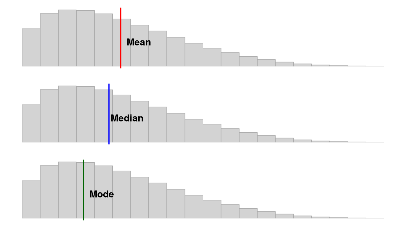
Note that depending on the shape of the distribution, the mean, median, and mode may not be the same value. If we have a normal distribution then they will be the exact same! However, if we have a positively skewed distribution, the mean and median will be pulled towards the positively skewed data, as shown in this figure by Peter Prevos.

Measures of Dispersion
There are also multiple measures of dispersion that describe the spread of our data:
Range: the difference between the maximum and minimum value (e.g., if the minimum score is 17 and the maximum is 49, then the range is 32)
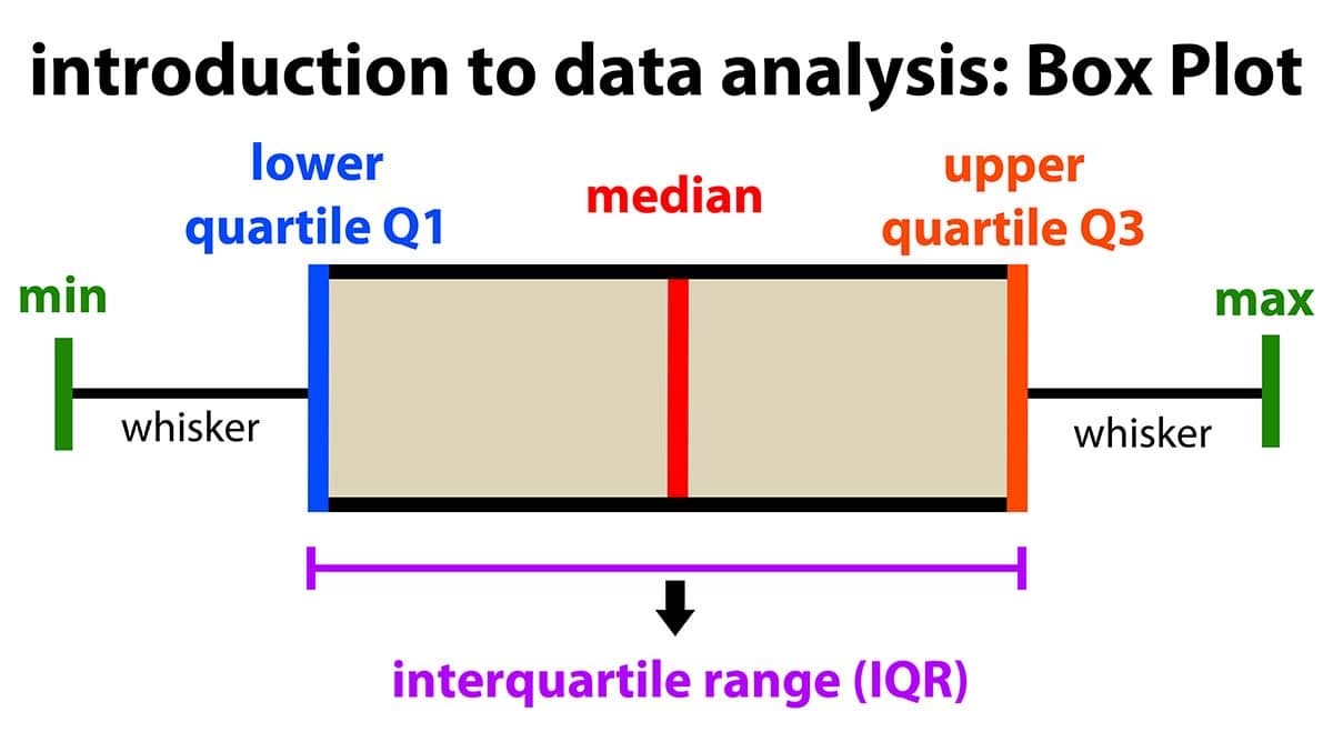
Quartile: when a dataset is divided into four equal parts, the first quartile (Q1) is at the 25th percentile, the second quartile (Q2) is at the 50th percentile, and the third quartile (Q3) is at the 75th percentile. Note that the median is also the 50th percentile!
- Interquartile range: the middle 50% (Q1 to Q3)
Variance: is the measurement of the spread between numbers in a dataset. More specifically, it is the sum of the squared deviations from the mean. This means first (a) calculating the mean, (b) subtracting each score from the mean (aka deviations from the mean), (c) squaring each of those deviations values, and (d) summing all those squared deviations. This is represented by the equation \(\frac{\sum (X-\mu)^2}{N}\)
Standard deviation: is the square of the variance. This is represented by the equation \(\sqrt{\frac{\sum (X-\mu)^2}{N}}\) if we are examining the whole population. If we only have a sample, we replace the denominator
NwithN-1.
I sometimes present equations, like above, to help some folks better understand various things in this course. However, I very rarely expect you to calculate things, and when I do, I give you a lot of support in how to do so.
Measures of the Shape of the Distribution
We also have two main measures of shape that describe the shape of the distribution of our data:
Skew: in a non-normal distribution, it is when one tail of the distribution is longer than another. Present in asymmetric distributions
Negative skew: when the tail points to the negative end of the spectrum; in other words, most of the values are on the right side of the distribution
Positive skew: when the tail points to the positive end of the spectrum; in other words, most of the values are on the left side of the distribution
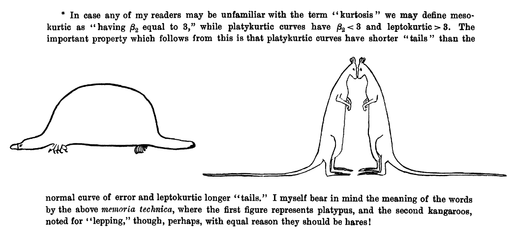
Kurtosis: the weight of the tails relative to a normal distribution. In other words, it’s how flat or skinny the distribution is. There are some fancy terms related to kurtosis that you may hear about, but honestly I don’t hear them used very frequently by researchers.
- Leptokurtic: light tails; values are more concentrated around the mean. Think of kangoroos which can be noted for “lepping”.
- Platykurtic: heavy tails; values are less concentrated around the mean. Think of a platypus!
Student (a pseudonym of William Gosset) wrote this in his 1927 paper).

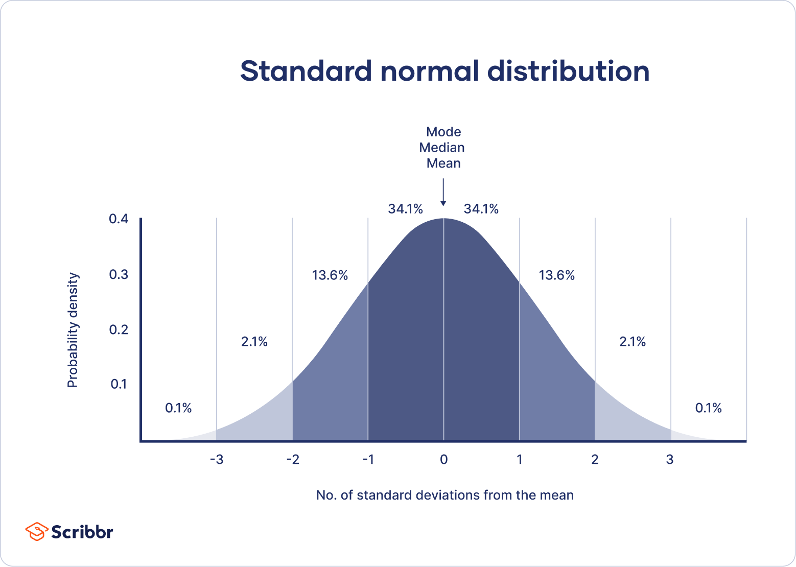
When skew and kurtosis are zero, then we have a special type of distribution called the normal distribution in which the data are symmetrical on both sides of the mean. We sometimes call this a “bell curve”. Scribbr has a great article on the normal distribution I encourage you to read!

Although there are many ways we can visualize the distribution the two most common ways we will visualize the distribution using jamovi are with a histogram which could also be a density curve or a boxplot. We’ll learn more about visualizing in Chapter 3 “Visualizing data”.

